Mistermiss
Branding

Mistermiss-Cover-1
New York, New York
—
Objective:
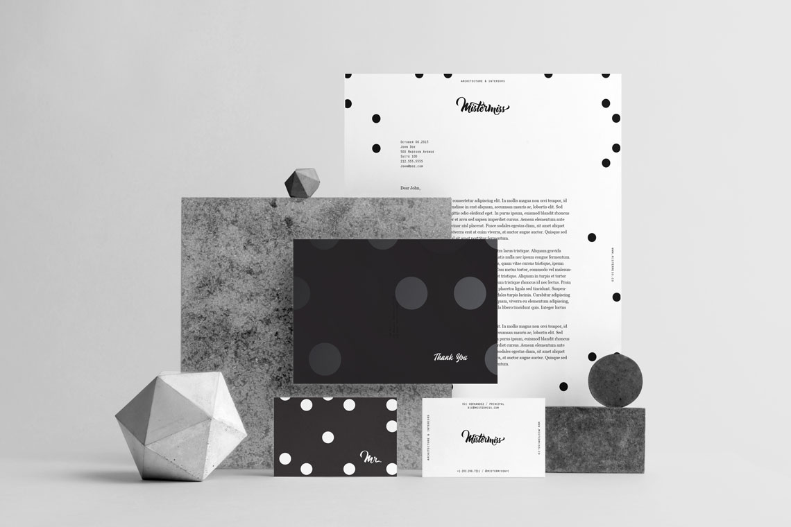
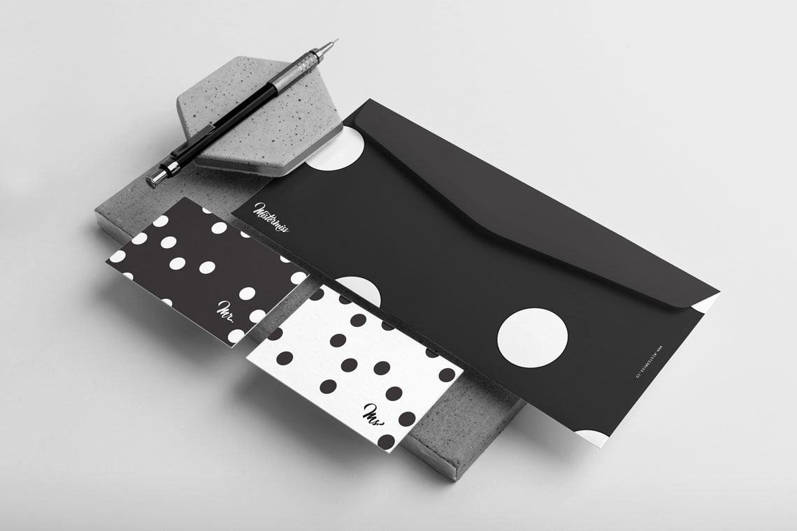
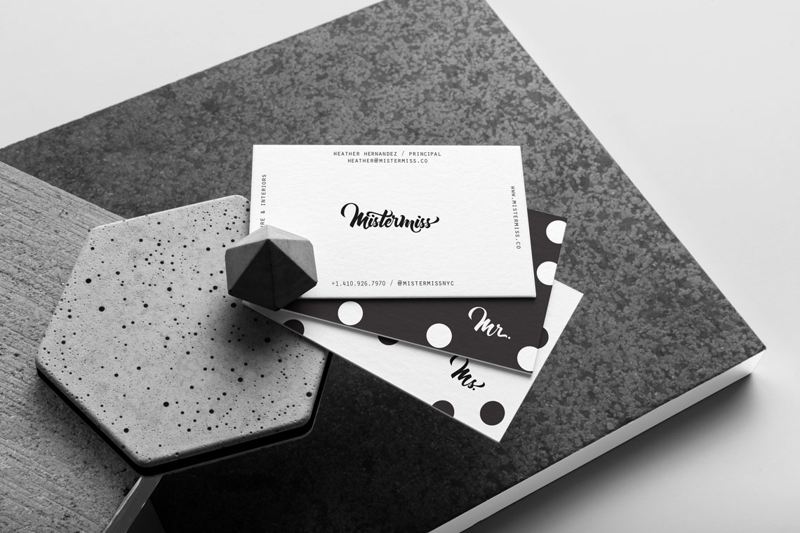
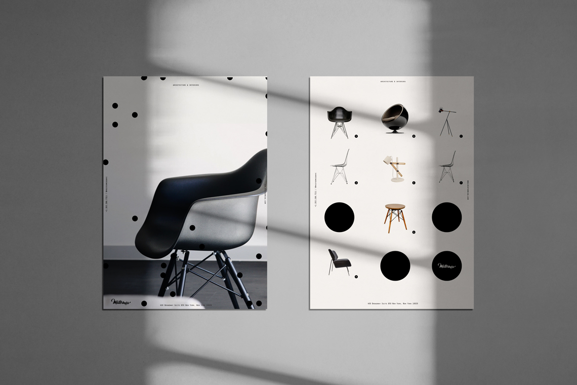
To create a lifestyle brand that focuses on the strength of individuality but also the power from collaboration. Mistermiss is an interior design studio that shapes spaces, designs furniture and objects. The concept is meant to be minimal but strong in order to create a diverse set of assets and language based on different aspects of the studio.
Solution:
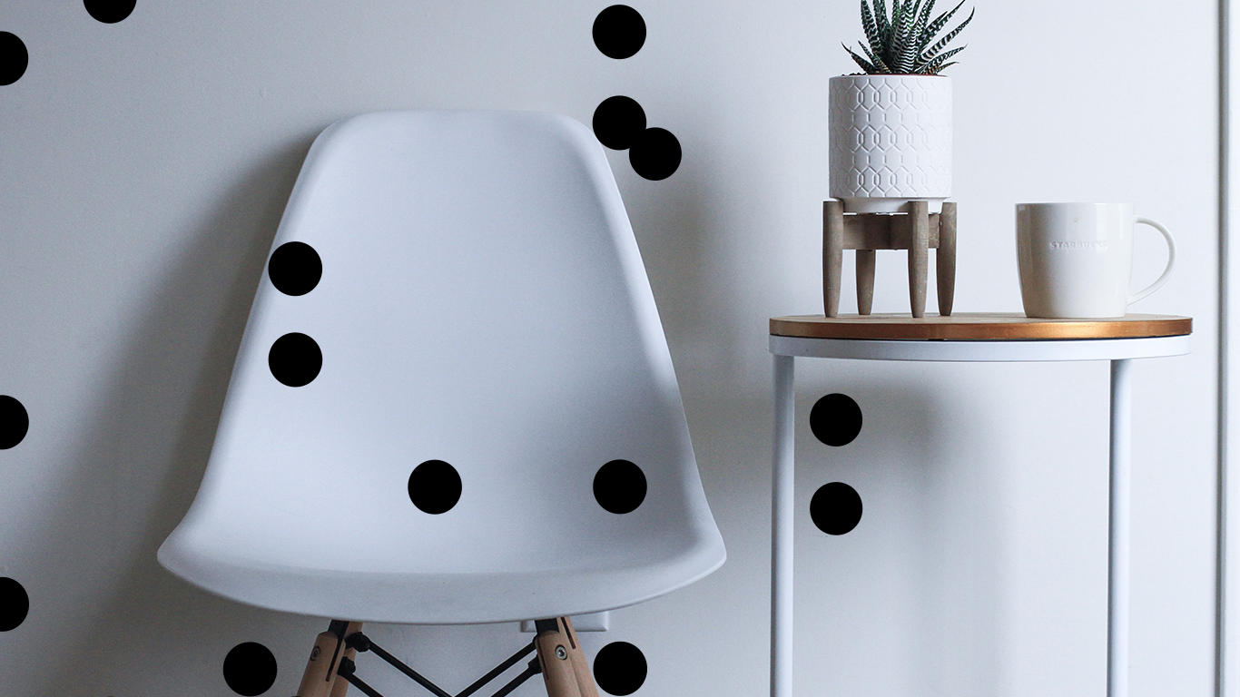
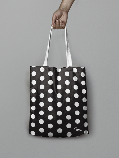
We explored different naming conventions for the studio and kept coming back to the notion of individuality and collaboration. Founded by a male and female founder, we wanted to highlight the individual experiences that give power and confidence to lead an entrepreneurial pursuit through a partnership. This reinforces the essence of the name and the graphic approach through the use of black and white with the polka dots. The pattern is used in ways to activate fields, tone done layout or focus on something.

04

02
Mister&miss-Stationery-2
Mister&miss-Stationery-3
Mister&miss-BusinessCard-3
Mistermiss-Poster-2
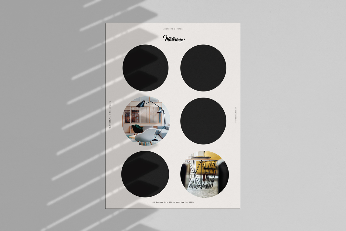
Mistermiss-Poster-1
Mistermiss-Cover-2
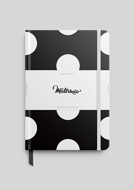
Mistermiss-Sketchbook
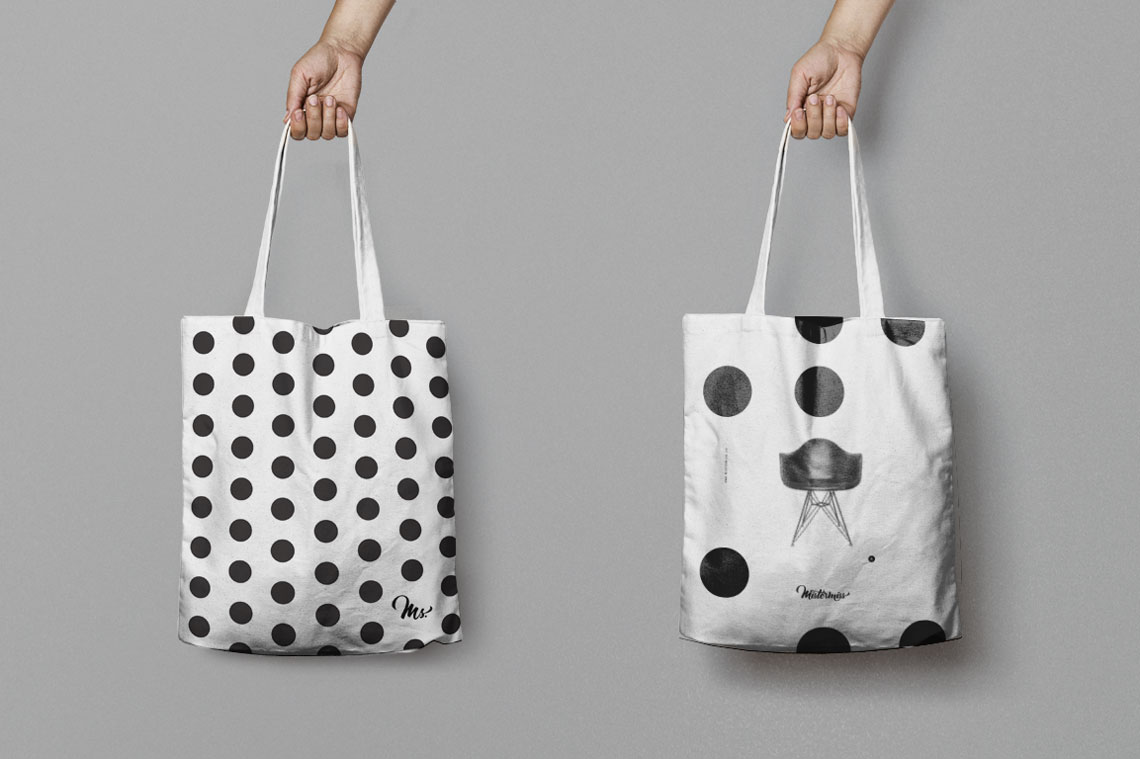
Mistermiss-totes
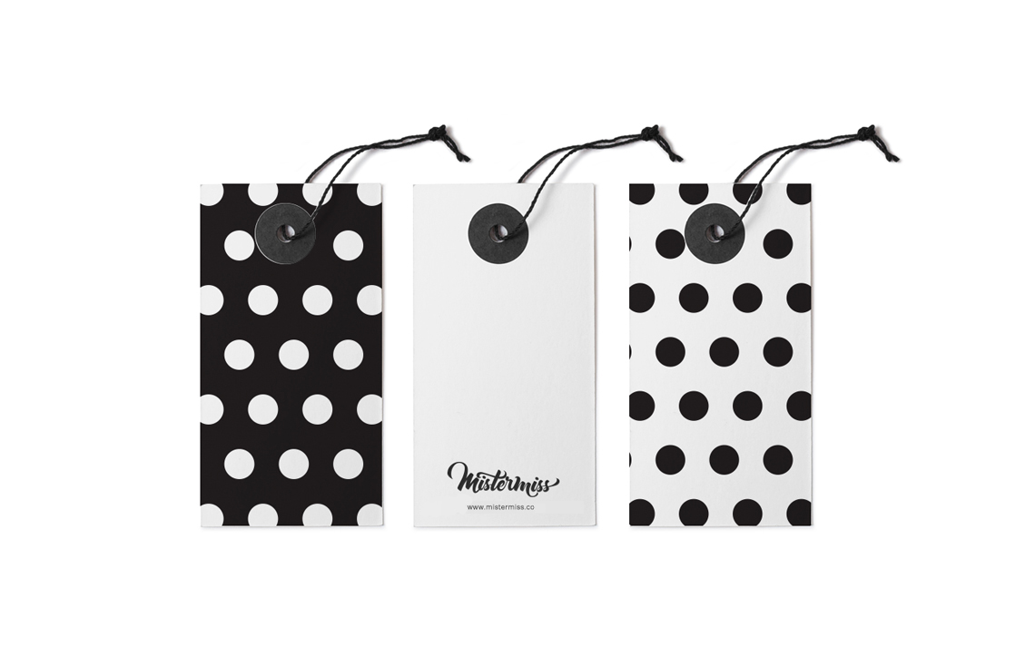
Mistermiss-Tag

Mistermiss-Card

Mistermiss-Envelope10
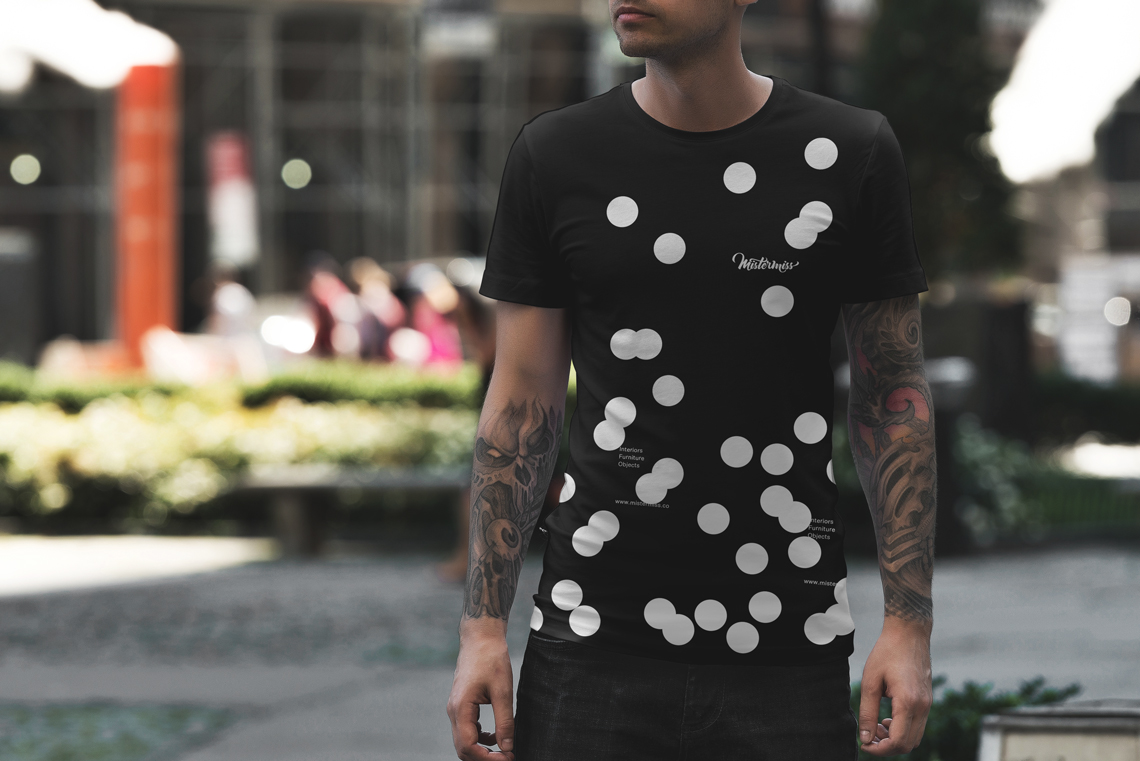
Mistermiss-male-tshirt
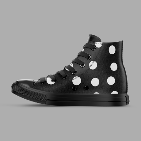
Mistermiss-Sneakers
Mister&miss-Mockup-Mr-Tote-bag